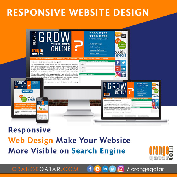
RESPONSIVE WEBSITE DESIGN
Responsive website design term is related to the concept of creating
a website in a manner that helps the layout to get changed according to the
user’s screen size and resolution. More precisely, the concept allows for an
advanced 4 column layout 1292 pixels wide, on a 1025 pixel width screen, that
auto-simplifies into 2 columns. Also, it suitably adjusts on the smartphone,
tablets and PC screens. This particular designing technique what we call
“responsive design”.
Responsive web designing is an entirely different designing
version than traditional web designing, and designers must know about the pros
and cons of responsive web designing. This blog is a mighty example of the
approach so we will reveal a few facts about the uses of responsive web
designing. The basic instinct might be to choose media queries to develop a
responsive site. However, the hassle one faces with media queries is that new
queries can pop up from moment to moment; each time, the user experiences sudden
and drastic changes to the look and organization of the site. Some of the
finest responsive websites were designed, developed and marketed by us in Doha
Qatar. Check https://orangeqatar.com .
Pages that include data tables pose a special challenge to
the responsive web designer. Data tables are extremely wide by default, and
when someone zooms out to see the whole table, it becomes too small to read.
When one tries to zoom in to make it readable, he or she is supposed to scroll
both horizontally and vertically to look through it. Well, there are several ways to avoid this
problem. Reformatting the data table as a pie or mini-graph is an approved
solution. The mini-graph fixes even in narrow screens.
In short, responsive web design refers to an approach to
designing web pages that ensures they look good regardless of the device used
to view them. The goal is to make sure that no matter the screen resolution,
window size, or orientation of the device, a web page is legible.
Images in responsive web designs are called context-aware.
This particular technique serves the purpose of responsive designing in true
sense as the images serve at different resolutions, ranging from larger screens
to smaller ones. The scaled images appear to change fluidly with the help of
updated developer tools and coding languages, allowing designs to look sharp in
every context.
The idea behind responsive web design is to use the same
HTML code regardless of the device being used to access the page. In this way,
the need to create separate websites is eliminated. The same elements of the
webpage are reshuffled to fit the viewpoint depending on its size. See the
screenshots below, showing the same page opened on a desktop versus a mobile
device.
Responsive web designing is remarkably different from
traditional designing in terms of technical and creative issues, and careful
use of this can do wonders while designing.


Comments
Post a Comment